
Layouts That Guide The Eye
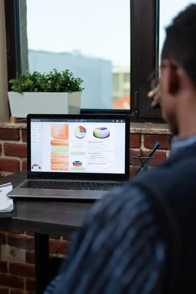
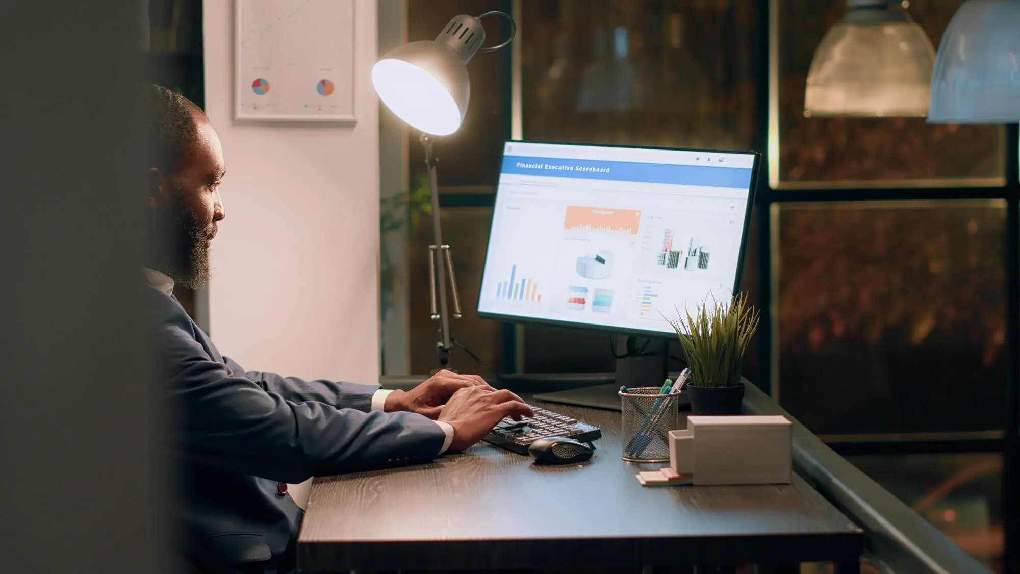
Use a Z-pattern or F-pattern to match natural scanning behavior, placing the primary answer where eyes land first. Group related metrics with whitespace, not borders, and reduce gridlines to lower cognitive load. Provide context near numbers—percent change, time window, and target—so interpretation is instant. Offer a calm default view with optional depth nearby. Design like you’re helping a tired friend after work, because future-you often will be exactly that.
Colors With a Job
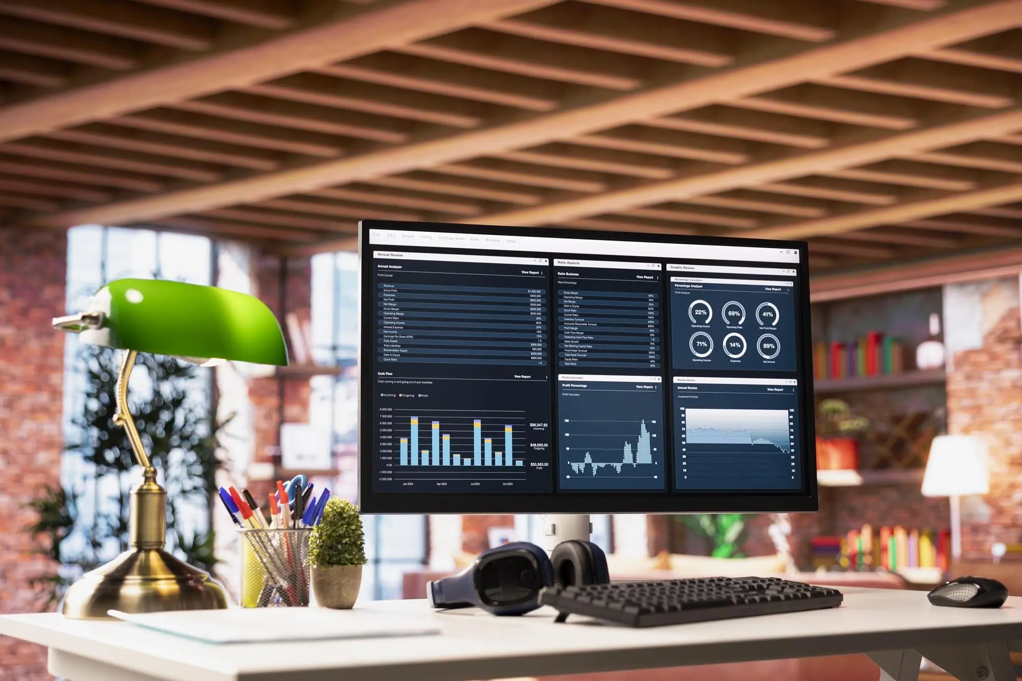
Assign colors intentional roles and stick to them. Green means on track, amber warns gently, red demands attention now. Use neutrals generously to let signals breathe. Encode categories with consistent hues across months to aid memory. Ensure sufficient contrast and provide non-color cues for accessibility. Limit the palette to avoid carnival vibes. If every tile shouts, nothing is heard. A disciplined scheme makes trends pop and calms anxious scanning when bills, deadlines, and choices crowd the day.

Accessible By Default
Design for varying screens, eyes, and energy levels. Favor readable fonts, generous spacing, and alt text on key visuals. Add keyboard-friendly controls and large tap targets for phones. Provide descriptive summaries so partners can skim and still decide confidently. Avoid tiny footnote math that hides risk. Build with the assumption a future collaborator will thank you later. The easier it is to use tired, distracted, or rushed, the more frequently it will guide real-life money moves.